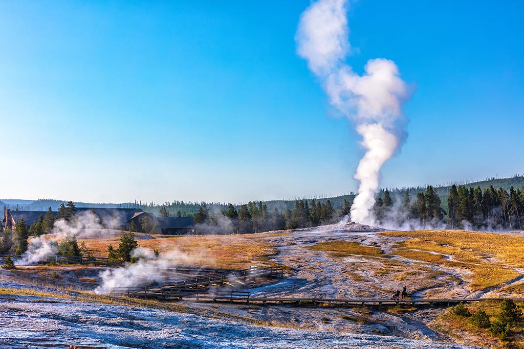
Thar she blows, Yellowstone National Park / Rebecca Latson
“Space … the final frontier …” No, wait a minute … I do want to discuss space with you, but this has nothing to do with night shots or "Star Trek."

Dawn over the mountains, Grand Teton National Park / Rebecca Latson

Summer monsoon clouds over the hoodoos, Bryce Canyon National Park / Rebecca Latson
What do the photographs above have in common, other than the fact they were captured in national parks? Negative space.
Huh?
Negative Space
I’ve been doing this photography thing for quite a while, and I'm sure I've heard the term “negative space,” although I can't rightly remember when I first encountered it. Yet, I apply the concept of negative space to all my images. So do you.
To put it simply, negative space, in photography, involves the space around and between the subject(s) of your photos. Positive space is your subject, while negative space is everything else, basically. In the photos above, the negative space is the sky. A photography article I recently read calls negative space a “natural balance” that provides a little “breathing room” within which your viewer can properly focus on the photo’s intended subject. Essentially, your composition should be framed so your national park subject (the positive space) is balanced by the negative space in a pleasing manner, as well as to emphasize a specific item or impression in your image.
Determining how much negative space to use in your image is sometimes a tricky thing to accomplish successfully while maintaining a great overall composition. For the images below from Grand Teton National Park, Bryce Canyon National Park, and Grand Canyon National Park, I took a single photo with quite a bit of negative space, duplicated it, then cropped it, so you see the same image, with a slightly different amount of negative-to-positive space ratio. When I look at the original vs. cropped, I notice that the originals have more of a big sky, wide-open vista feel about them. The cropped images, on the other hand, emphasize the photo's subject (positive space) moreso. After looking at each image, which one do you prefer? Remember, photography is a subjective art, so there's no real wrong choice, here.
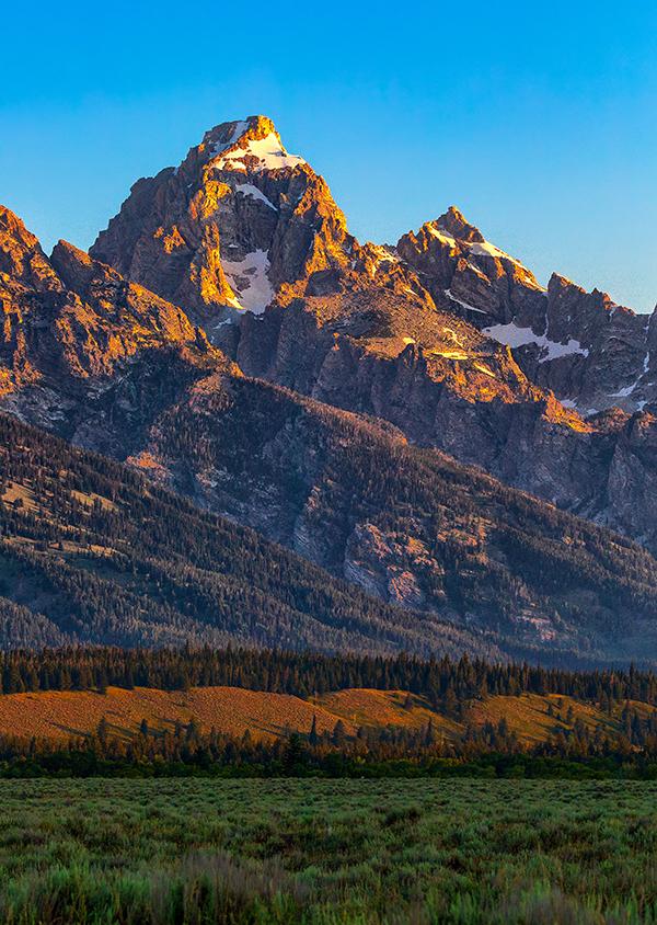
Sunrise over Grand Teton, Grand Teton National Park / Rebecca Latson
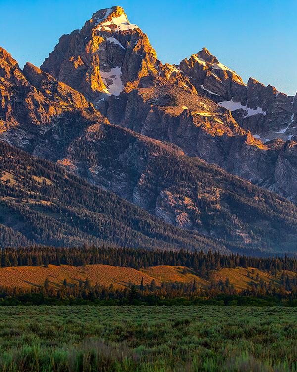
Sunrise over Grand Teton - cropped, Grand Teton National Park / Rebecca Latson

Negative space and the valley beyond - original, Grand Teton National Park / Rebecca Latson

Negative space and the valley beyond - cropped, Grand Teton National Park / Rebecca Latson

Thor's Hammer and redrock scenery, Bryce Canyon National Park / Rebecca Latson

Thor's Hammer and redrock scenery - cropped, Bryce Canyon National Park / Rebecca Latson

The beginning of sunrise over the North Rim, Grand Canyon National Park / Rebecca Latson
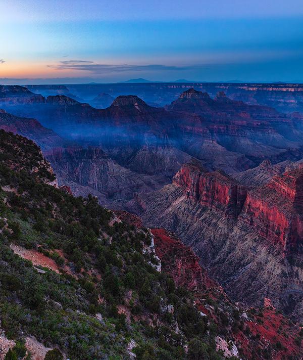
The beginning of sunrise over the North Rim - cropped, Grand Canyon National Park / Rebecca Latson
While I used the sky in the photos above as examples explaining this concept, negative space doesn’t just refer to the sky or "emptiness." Negative space is anything other than your subject (the positive space). So, in the Grand Teton National Park photos below, the pelican and the bison are each the positive space, while everything else around them (aka, their environment) is negative space.

Cruising along the Snake River, Grand Teton National Park / Rebecca Latson

Here's looking at you, kid, Grand Teton National Park / Rebecca Latson
How do you know when you are using too much or too little negative space? That's your call. How much negative space does your eye like? I know this sounds soooo scientific and precise, but your gut feeling when eyeballing a composition is generally a pretty good indicator of how much negative space to utilize.
Color Space

Eroded by time and the elements - uploaded to Traveler without first converting to sRGB, Canyonlands National Park / Rebecca Latson

Eroded by time and the elements - converted to sRGB color space prior to uploading to Traveler, Canyonlands National Park / Rebecca Latson
You may have noticed this with your own photos after you’ve uploaded to Facebook, Twitter, or even your own personal webpage. In my case, I noticed it when uploading to the Traveler, although I couldn't initially figure out why this was occurring. My lovely images looked washed out and the color was dull, even a little bit "muddy." Where did all that gorgeous light and saturated color go? Then, it dawned on me: color space was the culprit.
I read an interesting article about color space, which helped me understand the concept. To paraphrase the gist of that article, color space is the range of colors existing in an image. Perhaps you have heard of sRGB, Adobe RGB, and ProPhoto RGB. These are standard color spaces used when capturing, editing, printing, or uploading your photo. Even if you’ve never heard of all of these color spaces before, you are using one of them with your camera as well as your editing software. You may have been asked to make a choice of color space when setting up that brand new camera, or resetting a rental camera, or opening up or saving from a new editing application for the first time. FYI, most cameras, applications, and online sites default to sRGB.
The thing is, sRGB doesn’t have as wide a range of colors as does Adobe RGB, and Adobe RGB has less of a range than ProPhoto RGB. Does that mean we should all be using ProPhoto RGB? I'll get back to that in just a minute.
As I mentioned above, most devices and online sites are still set up to display an image using the sRGB color space. So, unless you switch to the sRGB color space when saving your image as a JPG, then when you upload your gorgeous, perfectly colored, perfectly saturated shot to an online site, that site will, more than likely, automatically convert your chosen color space into an sRGB JPG equivalent, using their own algorithm. As a result, you will notice a difference to your photo, either subtle or blatant.
Back to that question of whether or not you should simply capture your images using sRGB and be done with it, my answer to you is: No. If you care enough about your images to showcase them in the best light possible, then continue shooting and editing your images using Adobe RGB or ProPhoto RGB, then converting to the smaller color space when you need to. Bear in mind, after you convert to sRGB on your own computer, the photo now has less range of colors and light, so you need to bump up your saturation and your brightness, and maybe other settings, aprior to uploading or printing. This is what I do when uploading to the Traveler, and this color space correction makes all the difference in the world to the online result. Below is an image taken during my October 2018 visit to Mount Rainier National Park. I'd saved the original TIF file as a JPG without any color space conversion and then uploaded it to the Traveler's site, which automatically converted my JPG's color space to sRGB using its own algorithm.

An autumn view of The Mountain - uploaded to Traveler without converting to sRGB, Mount Rainier National Park / Rebecca Latson
A little dull and, maybe even a little muddy, right? Compare the image above with the image below, which I'd converted on my laptop from Prophoto RGB to sRGB before saving as a JPG, re-edited for color and brightness and then re-uploaded to the Traveler.

An autumn view of The Mountain - converted to sRGB color space prior to uploading to Traveler, Mount Rainier National Park / Rebecca Latson
Color space and negative space apply to all cameras. Regardless of whether you use a smartphone, point-and-shoot, or SLR, you should always take time not only to frame your composition for balance between negative and positive spaces, but also to make sure your shot looks the way you saw the scene. Before you roll your eyes and tell me that your shots go from smartphone to Instagram immediately so why bother with all that color space junk, think about whether you use any of the edit tools your smartphone or Instagram provide prior to uploading. When I capture a shot on my iPhone then post it to the Traveler's Instagram account @national_parks_traveler, I edit for color, structure, and light before posting.
It all boils down to this: Do you simply want a grab shot, or do you want something emphasizing your photographic talents as well as showcasing the beauty of that national park scene to your friends, family, co-workers, and social media followers? Did looking at a gorgeous, beautifully-saturated, well-lit image of a national park convince you to visit that park to see all that gorgeousness for yourself? Would you feel the same way about wanting to visit if that same shot was dull and not well-lit?
Think about it.
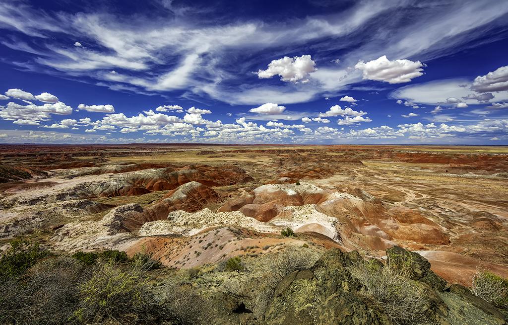
Painted Desert as far as the eye can see - not converted to sRGB prior to uploading to Traveler, Petrified Forest National Park / Rebecca Latson

Painted Desert as far as the eye can see - converted to sRGB color space prior to uploading to Traveler, Petrified Forest National Park / Rebecca Latson



 Support Essential Coverage of Essential Places



Comments
Very informative, with an emphasis to plan your shots.
thank you, I never thought about the color space conversion.
Rebecca,
For your reference:
https://photographylife.com/srgb-vs-adobe-rgb-vs-prophoto-rgb
https://kenrockwell.com/tech/adobe-rgb.htm
Thanks so much, Greg. The links you have provided are great tools for those Traveler readers and photographers who might wish to delve into more technical detail about color space.